Dashboard
The dashboard is the main analysis screen of Adoption. It brings together adoption indicators, charts, detailed tables, and file-level exploration for the selected organization and period.
At the top of the page, a shared period selector controls the analysis window. The selected date range applies to all tabs, ensuring every view reflects the same period.
Summary Tab
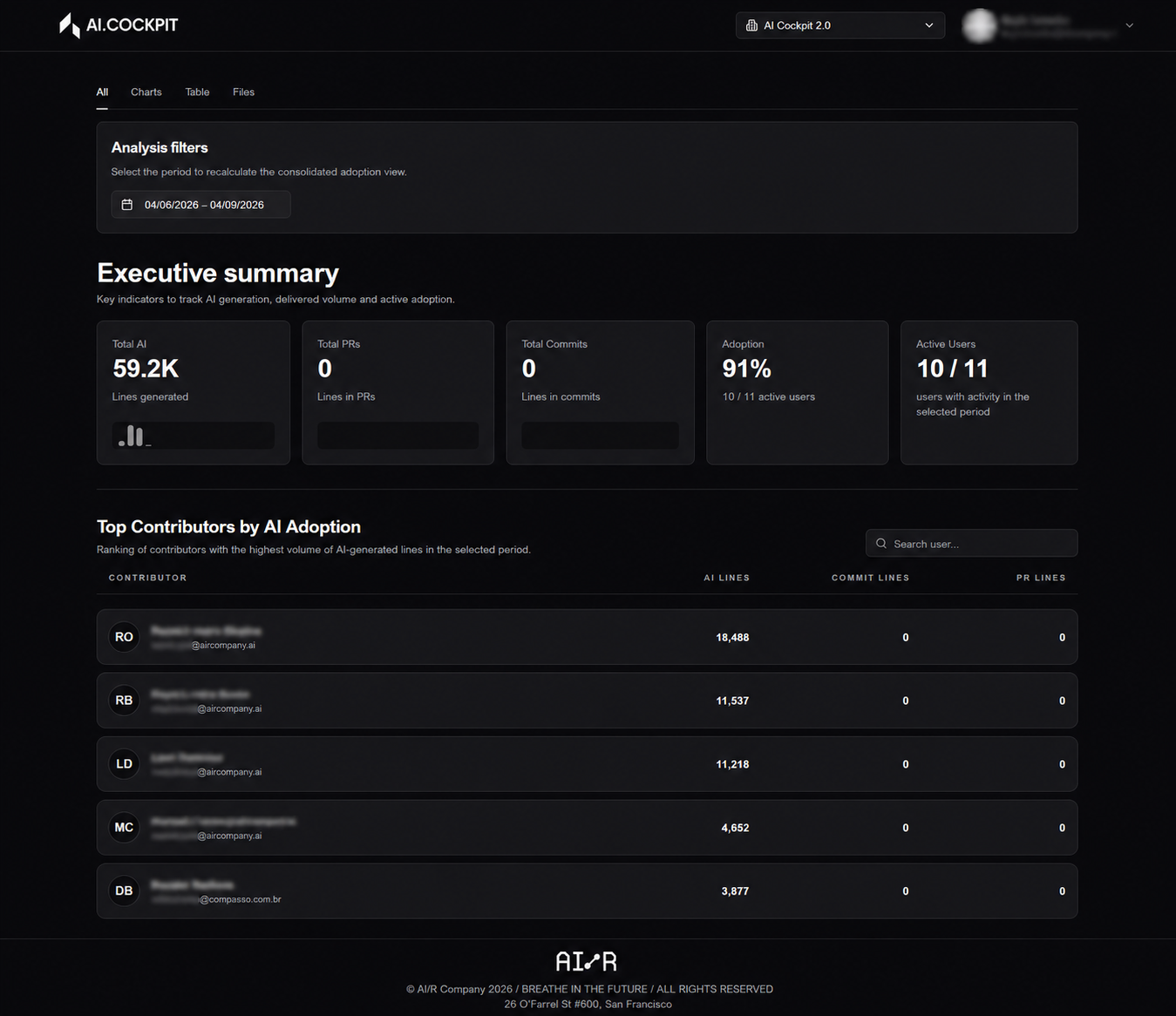
The default tab presents the executive summary for the selected period. It provides a quick overview of adoption behavior through KPI cards and a ranked list of contributors.
KPI Metrics
The summary area shows the following key indicators. Understanding each metric helps you interpret the state of AI adoption across your organization.
Total AI-Related Lines
What it measures: The total number of code lines identified as AI-assisted across all repositories and contributors in scope for the selected period.
How to interpret: This is the absolute volume of AI's contribution to the codebase. A growing number over successive periods indicates that AI tools are being used more actively in day-to-day development. A flat or declining number may signal that adoption is stalling or that contributors are not consistently using AI assistance.
Why it matters: This metric provides the foundation for understanding AI's footprint in your software delivery. It answers the question: how much of what was built was touched by AI? Leaders use this to track the raw output of AI adoption initiatives and to set targets for future periods.
Total Pull Request Volume
What it measures: The total number of pull requests opened or merged across all selected repositories during the period.
How to interpret: This metric provides delivery context for AI adoption data. On its own, a high PR volume indicates an active team. When read alongside AI-related lines, it helps you understand whether AI is contributing proportionally to the delivery pace — or whether it is being underused relative to the team's output.
Why it matters: Without delivery context, AI line counts alone can be misleading. A team with 10,000 AI-related lines but 500 PRs is using AI very differently from a team with the same line count and 50 PRs. This metric ensures adoption analysis is grounded in actual delivery activity.
Total Commit Volume
What it measures: The total number of commits registered across all selected repositories during the period.
How to interpret: Commit volume reflects the granularity and frequency of development activity. Comparing commit volume with AI-related lines reveals the AI density per commit — that is, how much of each commit is AI-assisted. A high ratio suggests AI is deeply integrated into the development workflow; a low ratio suggests it is used selectively or inconsistently.
Why it matters: This metric helps identify whether AI adoption is a habitual part of daily development or an occasional practice. Organizations aiming for consistent AI integration should track this alongside adoption rate to understand behavioral patterns at the contributor level.
Adoption Rate
What it measures: The percentage of active contributors who used AI-assisted tools at least once during the selected period, relative to the total number of active contributors.
How to interpret: This is the primary strategic KPI for AI transformation. A rate of 0% means no contributor used AI tools during the period. A rate of 100% means every active contributor engaged with AI assistance at least once. Track this metric over time to measure the breadth of adoption — not just the depth.
Why it matters: Volume metrics like AI-related lines can be driven by a small number of power users, masking low adoption across the rest of the team. The adoption rate surfaces this gap. It answers the question: is AI adoption widespread, or is it concentrated in a few individuals? This is the metric most directly tied to the success of AI enablement programs.
Active Users
What it measures: The number of contributors who made at least one commit or pull request in the selected period.
How to interpret: This defines the real team size for the period — the denominator used to calculate the adoption rate. A contributor who was on leave or inactive during the period is not counted, ensuring the adoption rate reflects actual participation rather than total headcount.
Why it matters: Normalizing adoption metrics against active contributors (rather than total registered users) produces a more accurate and actionable picture. It prevents the adoption rate from being artificially deflated by inactive accounts and ensures that comparisons across periods reflect genuine changes in behavior.
Below the KPI cards, the Top Contributors section identifies the contributors with the highest delivery volume during the period.
Charts Tab
The Charts tab is focused on visual analysis. It groups charts that help compare activity, inspect period evolution, and understand repository distribution.
AI vs Delivery Correlation
What it shows: The relationship between AI-assisted activity and overall delivery output across contributors or repositories.
How to interpret: A positive correlation — where higher AI usage aligns with higher delivery volume — provides evidence that AI tools are accelerating output. A flat or negative correlation may indicate that AI adoption is not yet translating into measurable delivery gains, or that adoption is concentrated in low-output areas.
Why it matters: This chart is the key evidence layer for justifying AI investment. It moves the conversation from "are people using AI?" to "is AI usage making a difference?"
Activity Evolution Over Time
What it shows: The trend of AI adoption metrics — AI-related lines, commit volume, PR volume, and adoption rate — across the selected period.
How to interpret: An upward trend signals growing adoption momentum. A flat line suggests adoption has plateaued and may need intervention. A declining trend warrants investigation into whether tooling, process, or motivation issues are reducing usage.
Why it matters: Point-in-time metrics tell you where you are; trend charts tell you where you are going. This view is essential for evaluating whether adoption initiatives launched in a given period are producing lasting behavioral change.
Repository Comparisons
What it shows: AI adoption metrics broken down by repository, allowing side-by-side comparison of adoption levels across different codebases.
How to interpret: Repositories with high AI-related line counts and high adoption rates are leading the adoption curve. Repositories with low metrics are lagging and may benefit from targeted enablement, tooling review, or contributor coaching.
Why it matters: Adoption is rarely uniform across a codebase. This chart pinpoints exactly where to focus enablement efforts, making it a practical tool for engineering managers and team leads who need to prioritize their interventions.
Distribution of Commit and Pull Request Volume
What it shows: How commit and PR activity is distributed across repositories and contributors during the period.
How to interpret: A highly concentrated distribution — where a small number of contributors or repositories account for most activity — may indicate that AI adoption is driven by a few individuals rather than the team as a whole. A more even distribution suggests healthy, widespread adoption.
Why it matters: This chart complements the adoption rate by revealing structural patterns in how AI usage is spread. It helps identify adoption gaps that aggregate metrics might obscure.
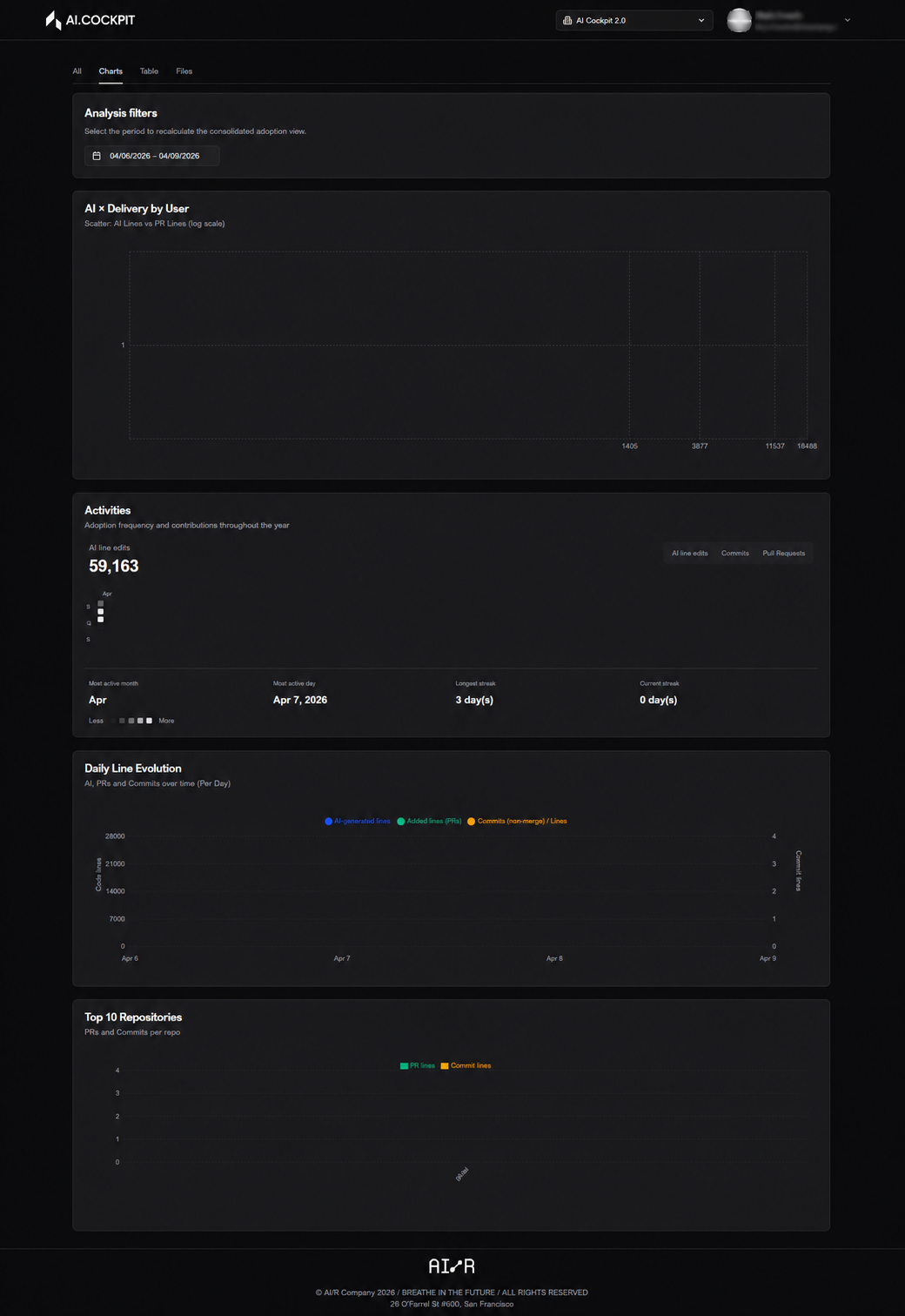
Table Tab
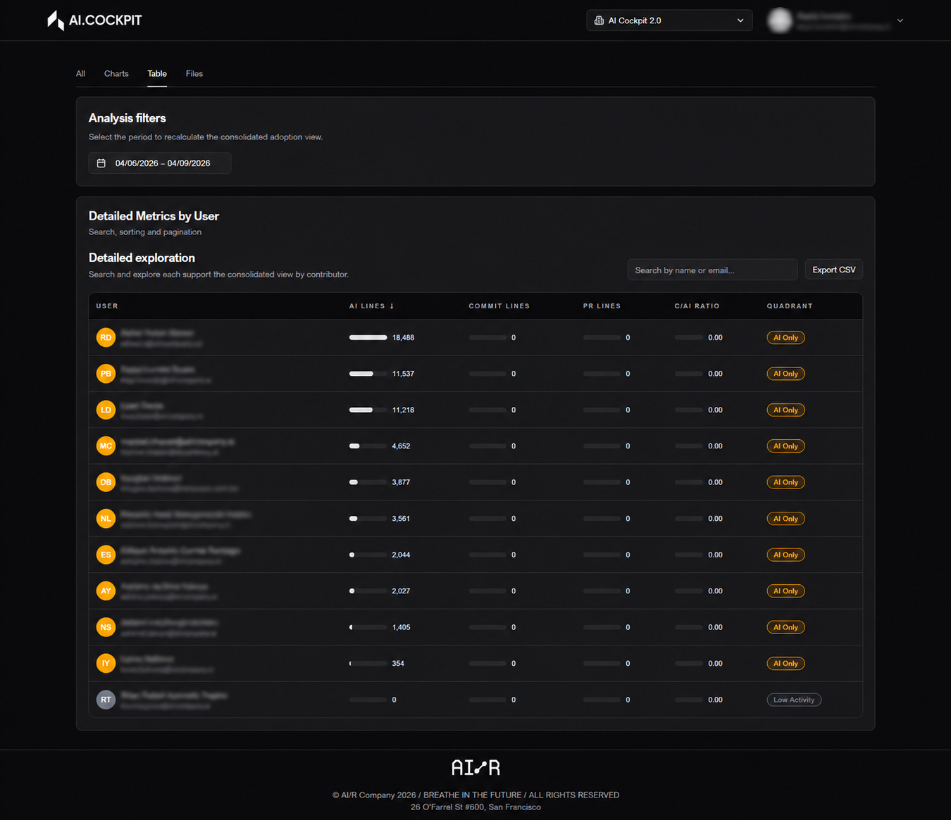
The Table tab shows the same analysis in tabular format, making it easier to compare contributors, sort by specific metrics, and inspect detailed ratios.
Use this tab to:
- rank contributors by AI-related lines, commit volume, or adoption rate
- identify contributors with high delivery volume but low AI usage — potential targets for enablement
- export or review precise values that charts approximate visually
Contributor Usage Profiles
Use the table to segment contributors by usage intensity. These profiles provide a practical basis for directing enablement and identifying contributors who are leading adoption.
| Profile | Signal | Suggested Action |
|---|---|---|
| Heavy User | High AI-related lines, consistent across periods | Share their workflow as a reference for the team |
| Regular User | Moderate AI usage, growing or stable pattern | Reinforce habits; share best practices |
| Light User | Occasional AI usage, low volume relative to delivery output | Targeted coaching; identify what is preventing consistent use |
| Non-User | Active contributor (commits/PRs) but zero AI-related lines | Primary enablement target; investigate what is preventing adoption |
Sort the table by AI-related lines descending to identify heavy users quickly. Contributors with high commit or PR volume but low AI lines are the most actionable targets for enablement.
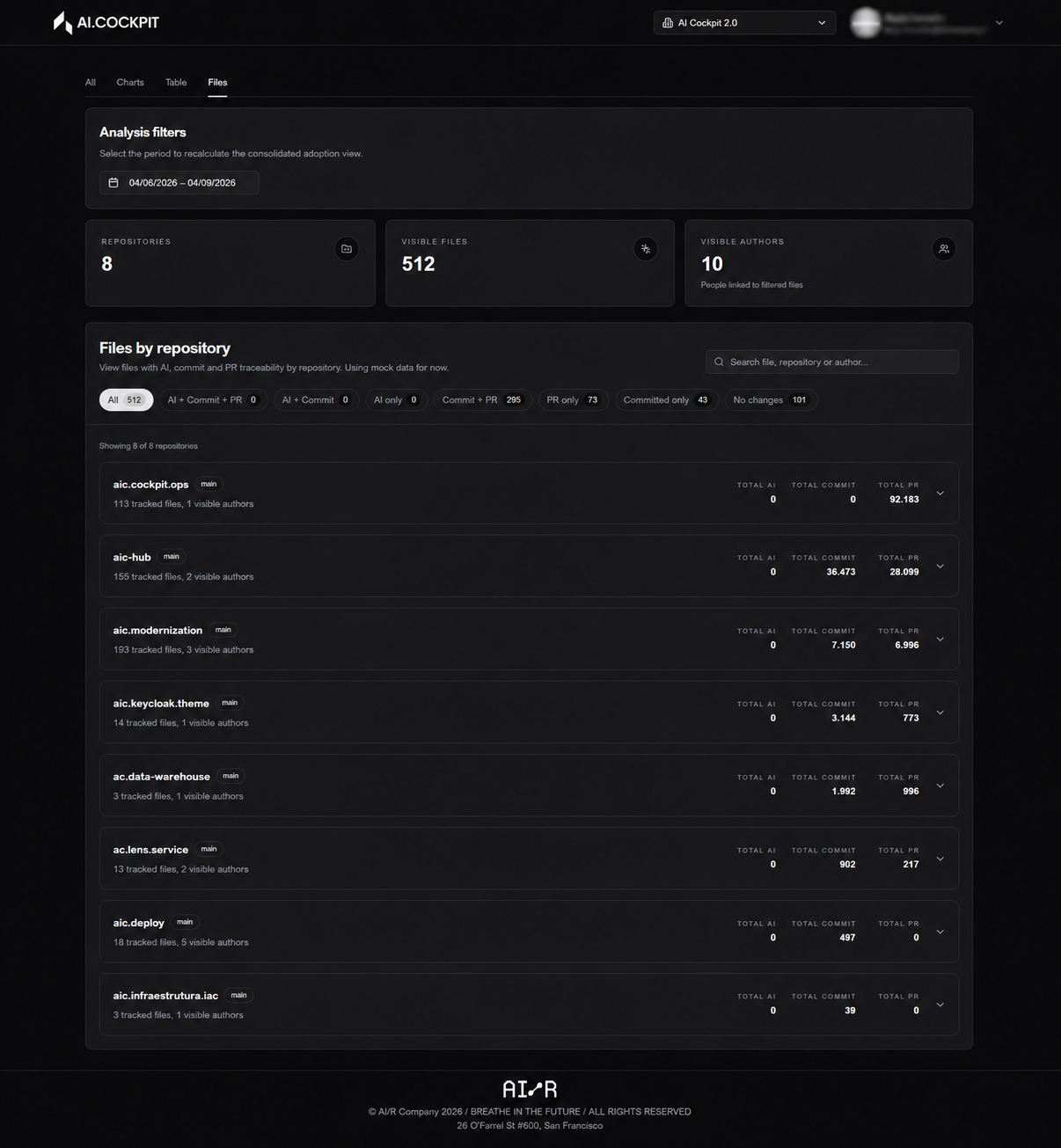
Files Tab
The Files tab is dedicated to file-level exploration. Use it to identify where AI-related changes are concentrated and which repositories or contributors are associated with those changes.
This level of detail is useful for:
- understanding which parts of the codebase are receiving the most AI-assisted attention
- verifying that AI usage aligns with strategic priorities (e.g., new features vs. legacy maintenance)
- investigating anomalies surfaced in the summary or charts tabs
If the application has not been fully configured, or if synchronization has not been run for the selected period, the dashboard shows empty states or warning messages. Configure the provider and run synchronization from the Synchronization page first.
Next Steps
- Synchronization — run or review synchronization jobs
- Settings — configure the provider and repository scope